Overview
In 2024, the GoSky Chatbot Platform faced business challenges such as low subscription rates and difficulties in market promotion. Based on our market analysis and user research, I initiated a product design improvement plan beyond the existing product roadmap.
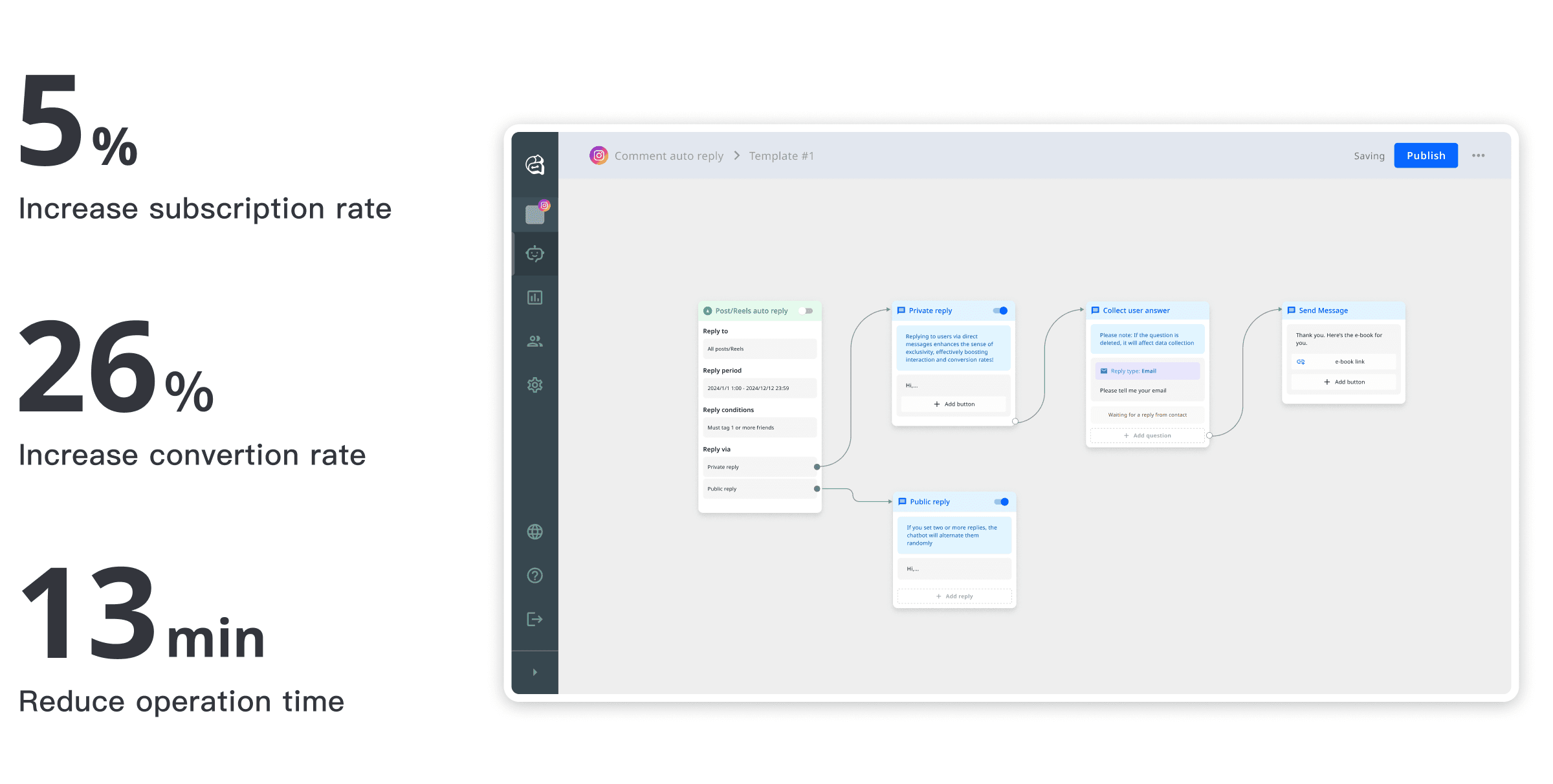
As a result, I redesigned the user flow, aligned the design more closely with the product's positioning, and led to increased subscription and conversion rates.
My role
Improve product usability through UI/UX design, increasing the subscription rate.
Collaborate with the Product lead, PMs and RDs to align on project goals and define success metrics.
Analyze product data and conducted 5 user interviews and 3 usability tests.
Iterate on the design system to align with the product positioning.
About GoSky Chatbot Platform
GoSky Chatbot Platform is a CRM dashboard designed for marketers, with active users in Taiwan, UK, US, and HK. The system integrates with Meta's API services to automate interactions on social medias, including comment replies, private message responses, message broadcasting, fan profile analysis.

Problem & Challenge
Based on our market research and user studies, we identified the following key problems:
Numerous obstacles during setup:
Marketers and content creators faced frequent failures and uncertainty about whether settings were applied successfully.The average subscription rate was only 0.3%:
This not only impacted revenue but also indirectly led to a decline in external investment.Product position — Self-serving:
To differentiate this product from competitors, it was positioned as a self-serving platform. However, the former designer had directly copied competitor designs, resulting in a mismatch with our TA and the significant design debt.
Research
I reviewed product data, participated in 5 interviews, and conducted 3 usability tests. Through this process, I identified the main product issues:
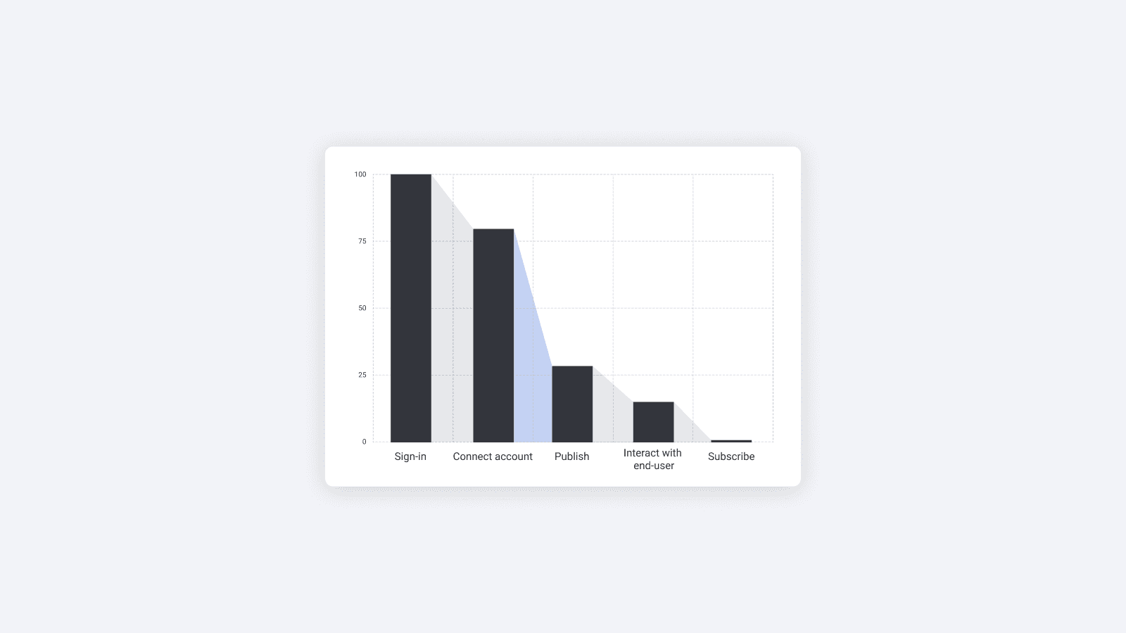
The highest user drop-off occurred during the "Connect Account → Publish" flow.
The setup process was overly complicated, with too many unnecessary fields.
Users struggled to understand whether they had completed the setup successfully.

Design process
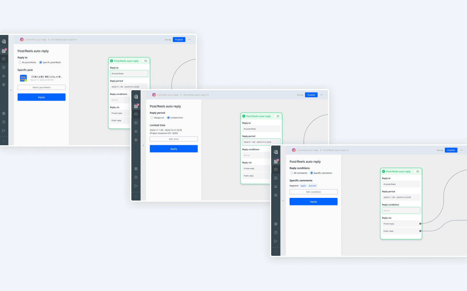
By integrating the setup features directly into the Canvas, we reduced page switching and decreased user drop-off.
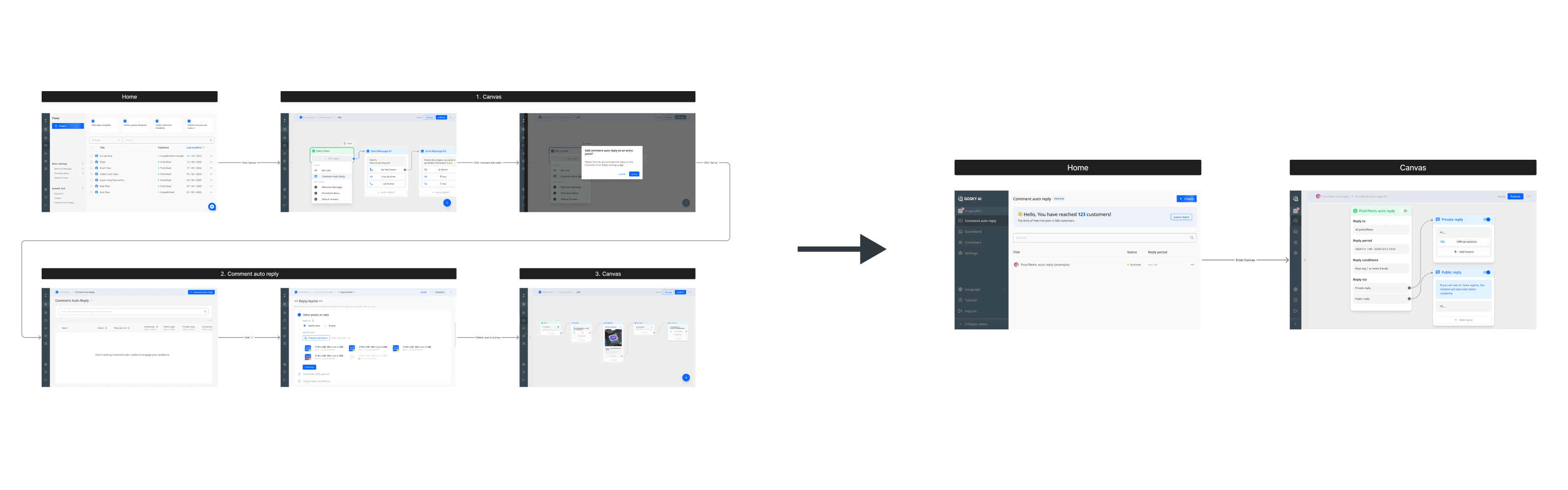
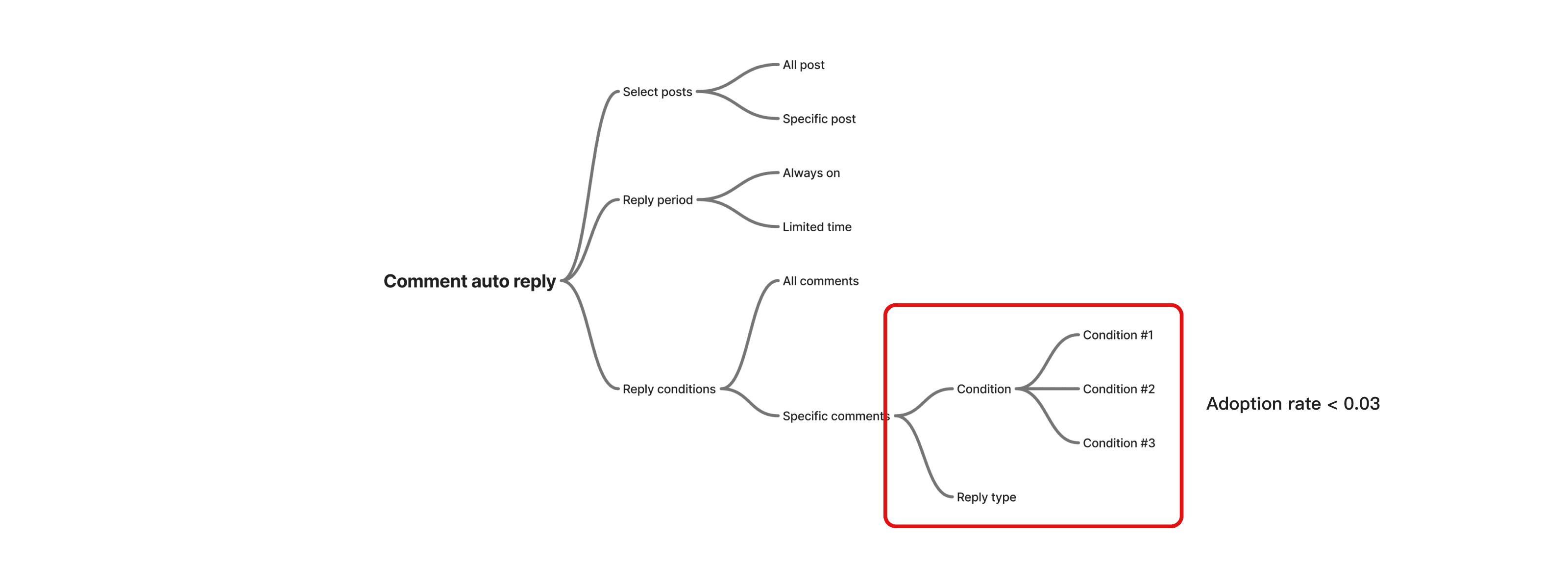
I addressed feature logic from the IA. Interviews revealed that less than 3% of advanced users utilized the "multi-condition" feature. Based on the product’s positioning, we simplified the setup logic into 2 layers.

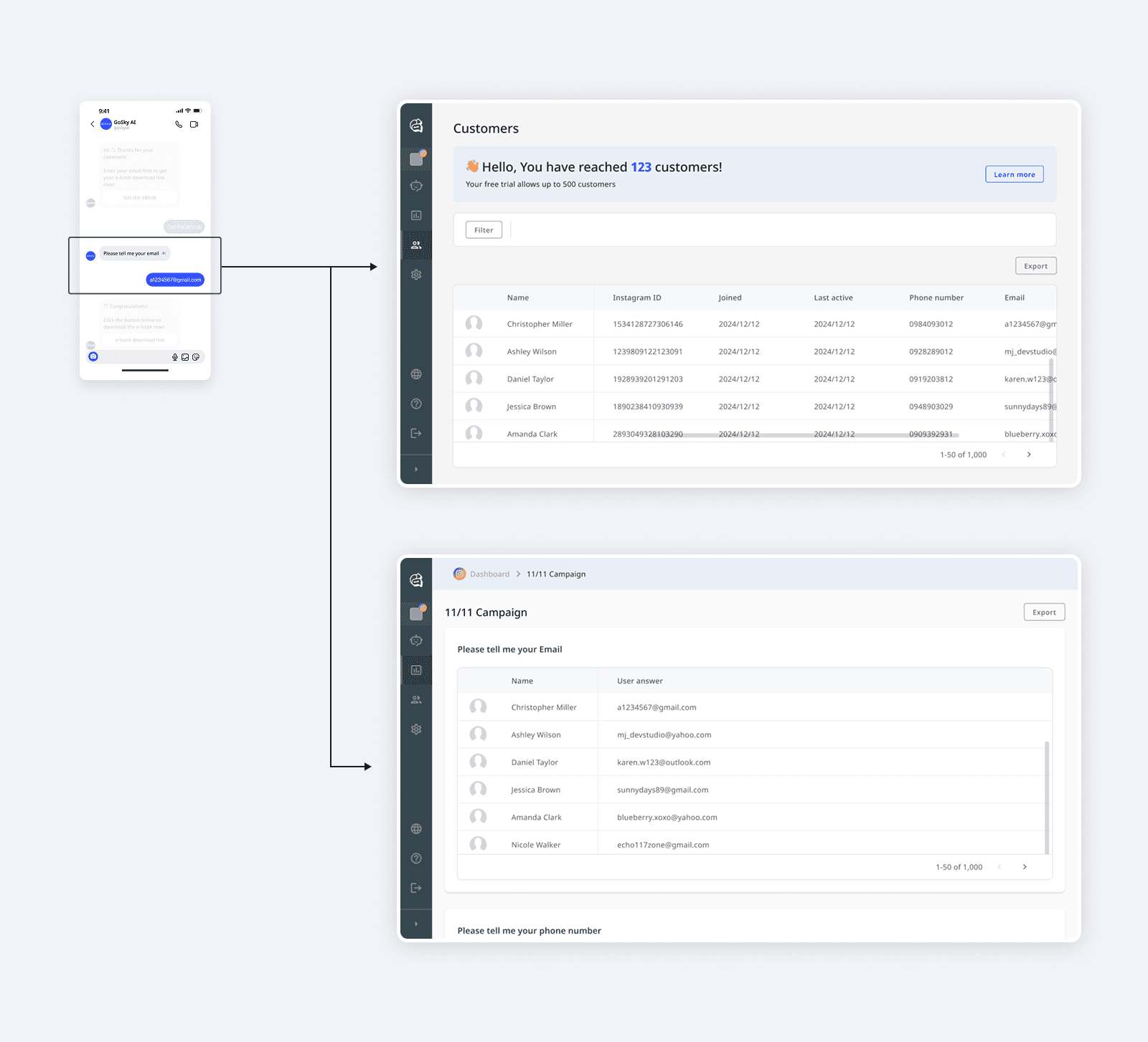
Redesign and separate the User Answer Page so that users can analyze the performance and view the list for marketing campaigns.
Test & Iteration
After testing the 1st version, I observed that 60% users repeatedly clicked when setting the "collect user answer" feature. The issues included:
Unclear clickable area and visual hierarchy
Information flow didn't match user expectations
Then I tried 6 design variations, discussing usability with the PM, confirming technical feasibility with the RDs. Finally moved forward with a 2nd round of testing.
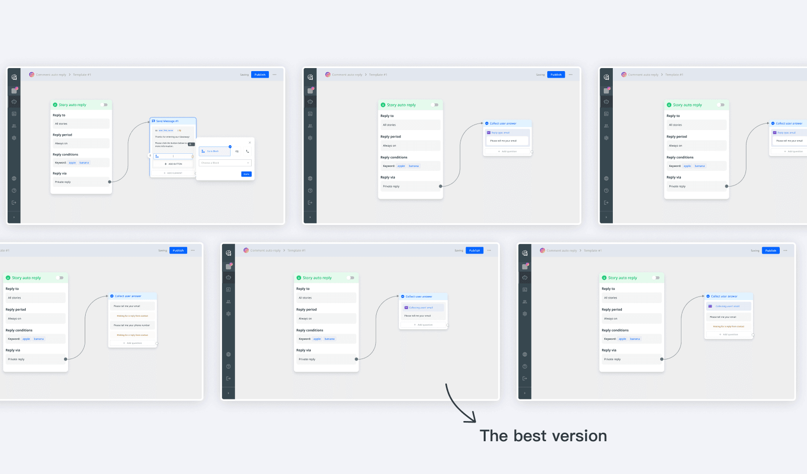
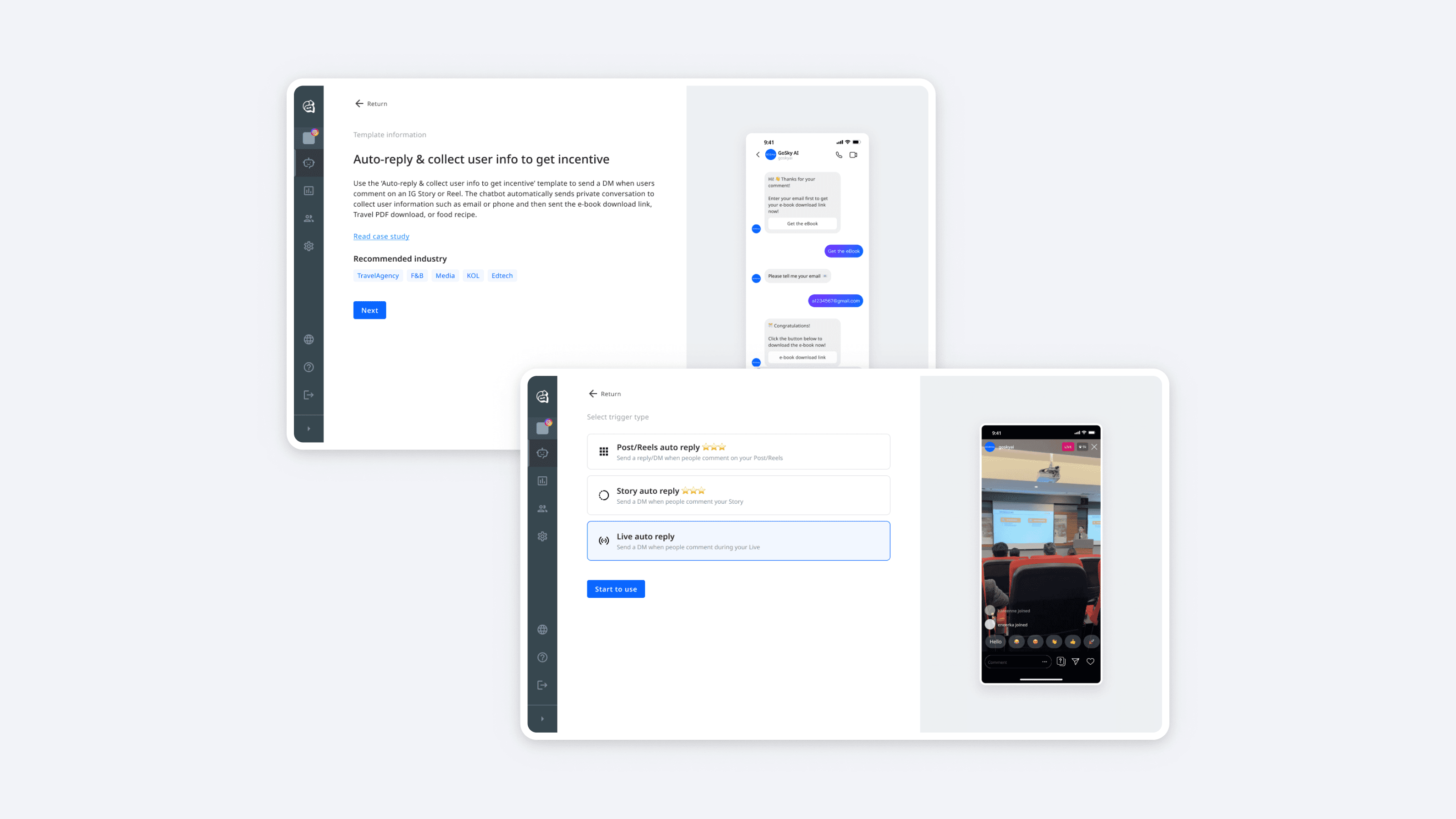
Here's the final version of blocks design in Canvas:


Design iteration for product positioning — Self-serving
To better align the product design with its positioning (self-serving), I conducted several iterations focused on the consumerization of B2B.
Preview pages: I designed preview pages that allows users to visualize their setup from end-users' perspective. This helped bridge the gap between 2B and 2C users.
Aha! moment: During testing, I found that users experienced a high level of uncertainty during the setup process. I enhanced the emotional design to reinforce user confidence and satisfaction. And finally increased the “perceived completion of publishing” rate from 66% to 100%.

Pricing strategy: To better match the behavior of 2C-style users like content creators and KOLs, I replaced time-limited trials with usage-based limits, clearly shown on the homepage. This reframed restrictions in a positive way, reducing friction and improving trial conversion.

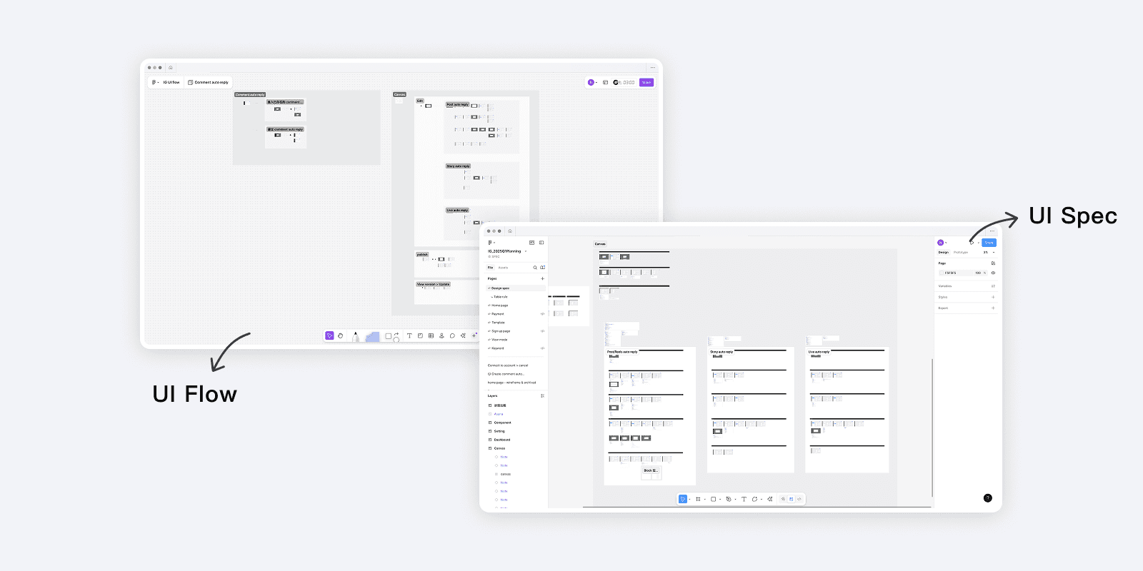
Hand-off
UI Flow & UI Spec
Design System & Component Guideline

Result & Impact
This project led to several impactful outcomes and positive feedback.

Reflection
Due to time constraints, this project adopted a growth design approach. I leveraged data-driven decision-making and conducted multiple A/B tests to help the team achieve our project goals. The final outcome delivered positive results and meaningful business value for the team.
What I brought to the team…
Persuading the team by applying different design strategies to accomplish the project goals.
Translating business problems into design solutions that addressed real user needs.
Collaborating closely with team members, using rapid testing and iteration to find user-friendly designs.