
Background
Webduino Online Store is the e-commerce platform under our SaaS product line, offering hardware product, software licenses, and educational books.
After a market pivot, parts of the website remained outdated, failing to engage customers and leading to low conversion rates, ineffective distributor promotions, and potential customer loss.
In response, our team proactively launched a short-term sprint project to quickly address these issues and drive improvements.
Team
My role
Product Designer
E-commerce platform UI/UX design
Data analysis and product Strategy
Product web page Redesign
Members
Product Designer
Marketing Designer
Business Development Manager
Main Result

Problem
The 5-year-old platform wasn't fully updated after a market shift, causing customer loss.
The B2B SaaS model didn’t match typical user buying behavior.
Sales differed greatly between product versions.
Resellers struggled without a platform to clearly present product value.
Challenges & Constraints
01 Prioritization Trade-offs
Due to limited resources and a tight timeline, we focused on the most critical and impactful improvements.
02 Technical Constraints
The e-commerce platform was built on SHOPLINE, which offers limited flexibility. All design improvements had to work within its technical constraints.
03 Data Analysis
SEO traffic volume alone does not guarantee direct value conversion; it's essential to analyze data characteristics and align with the product’s business model for effective use.
Strategy & Planning
My team and I, including the Marketing Designer, planned and designed based on existing business data, the business model, and user flows.
As a B2B SaaS company’s e-commerce platform, the focus is not on one-time purchases but on the e-commerce role in the overall process and maximizing customer lifetime value.
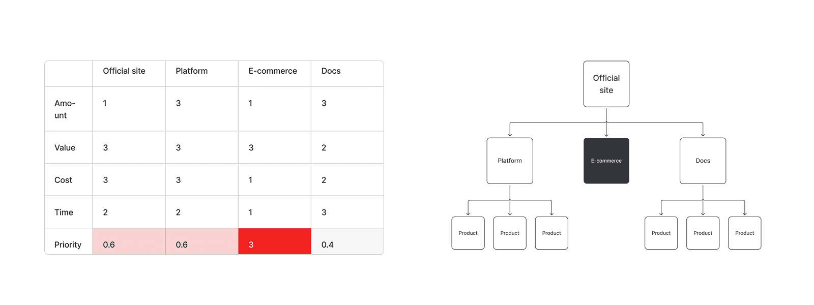
01 Prioritizing task selection
Due to limited resources and tight timeline in this voluntary project, we prioritized the most urgent and effective improvements.
Abstract tasks by listing their value, cost, and time required.
Estimat task priority.
Consider pressures from resellers and sales teams, focusing on updating the e-commerce platform and product pages that promised the quickest, most impactful results.
02 Audience segmentation
Built AARRR model for the e-commerce platform.
Categorized visitor sources (online and offline).
Analyzed customer purchase and repurchase timing.
Purchase cycle: 2 months to 1 year.
Loyal customers (repeat buyers) form after 1 year (semester-based).

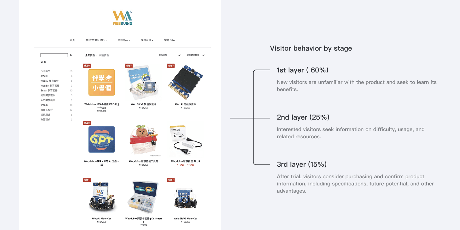
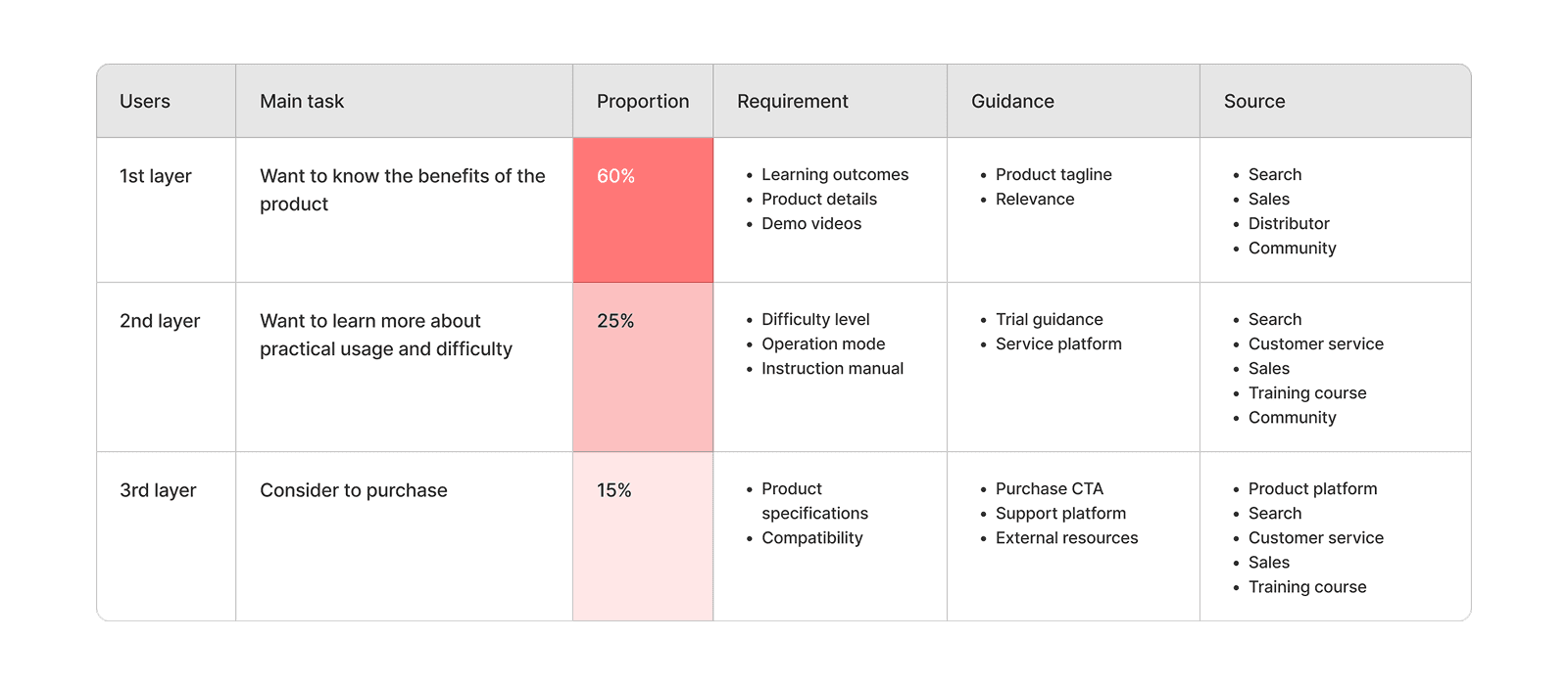
03 Predict and plan user journeys
Customers have long purchase cycles, so we planned a long-term journey, dividing users into 3 stages with tailored needs and actions.
1st stage: Learn how the product benefits them
2nd stage: Understand usage and difficulty
3rd stage: Decide whether to purchase
Design Plans
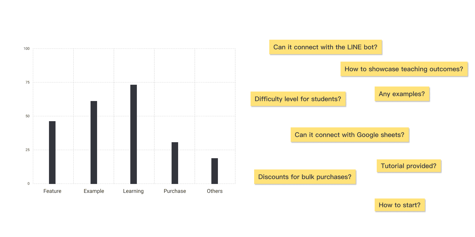
01 Customer research and product positioning summary
Collected user feedback on the e-commerce platform and products through interviews and surveys, then summarized the audience’s needs into three stages.
02 Product page redesign
Based on the categorized insights, designed corresponding product page sections aligned with user needs and behavioral goals, then arranged them sequentially to create the product page.


03 Usability test and heat map analysis
Used usability tests and Hotjar heatmaps to adjust the e-commerce page content order and visual layout.

Design Iteration
Improve profit channel flow efficiency
Problem: Testing revealed that the product detail page is not ideal for main business conversions.
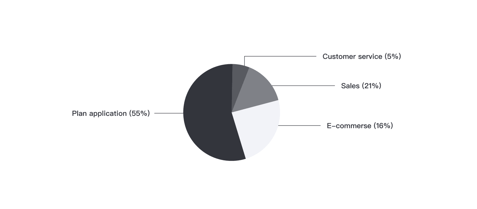
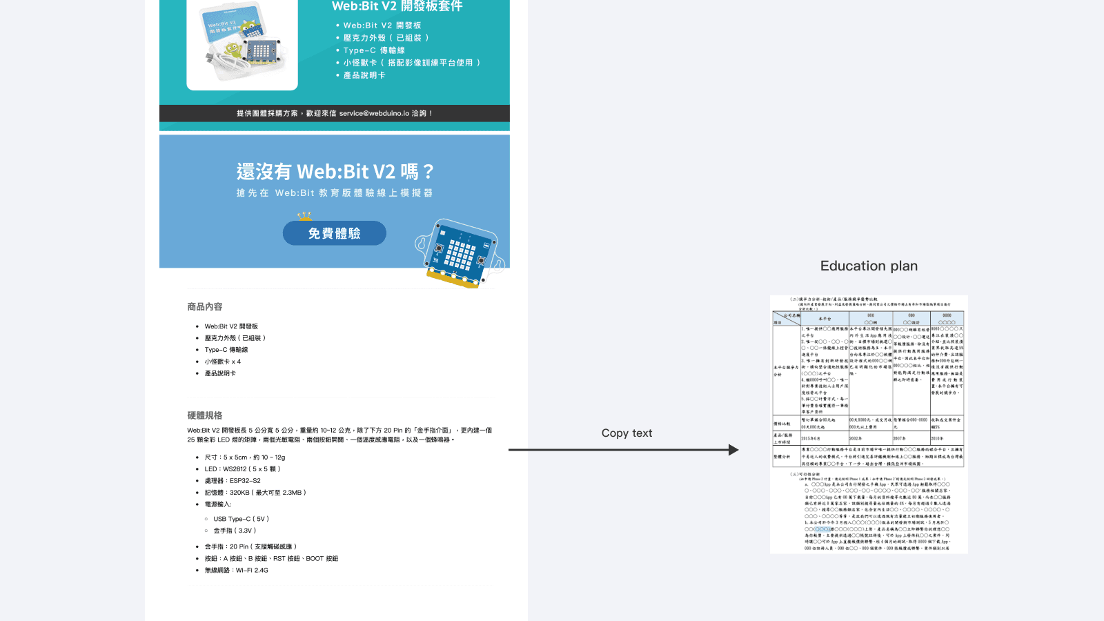
55% of revenue comes from education program applications, where users copy product details and specifications into application forms. However, image-based product content hinders easy copying for applicants.
Solution: Add plain text with at the bottom of the product detail page, allowing applicants to easily copy the information and reduce text input time by about 15 minutes.
Reduce sales gaps
Problem: After launch, different versions of the same product show large sales disparities. Marketing wants to boost the selection rate of higher-priced models.
Solution: Changed the style selection to a “button toggle” format, allowing users to see all options at a glance. This shifts user behavior from “whether to choose this style” to “which style to choose,” increasing the selection rate of higher-priced models.


After adjusting the interaction mode, the sales gap between two styles of the same product narrowed by about 15 units.

Results & Impact
Qualitative:
Positive feedback from sales and distributors.
Users reported a better browsing experience during testing.
Data analysis from the design process was shared with the business team.
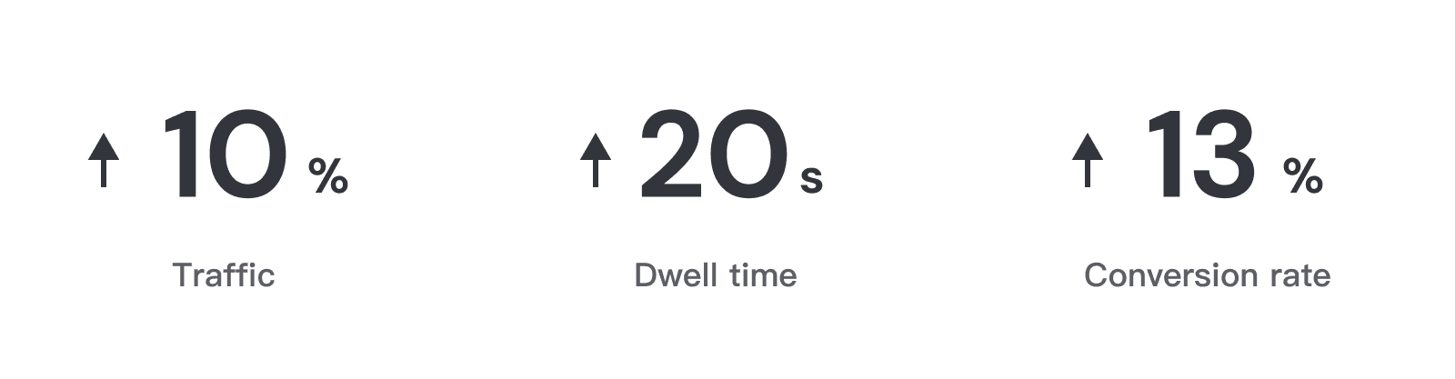
Quantitative:
E-commerce traffic increased by 10%.
Average website session duration increased by 20 seconds.
Conversion efficiency on main channels improved by 13%.
Also indirectly increased the number of users on the platform.

Insights & Reflections
This spontaneous project addressed user conversion paths and sales/reseller promotion challenges.
The biggest gain was working with the team to explore the platform’s potential within limited resources, while systematically tackling each product design issue.
What I brought to the team…
Prioritize tasks within given constraints and proactively initiate projects.
Analyze product status and customer conversion paths from a product designer's perspective.
Drive design with qualitative and quantitative data to help the team achieve business goals.