
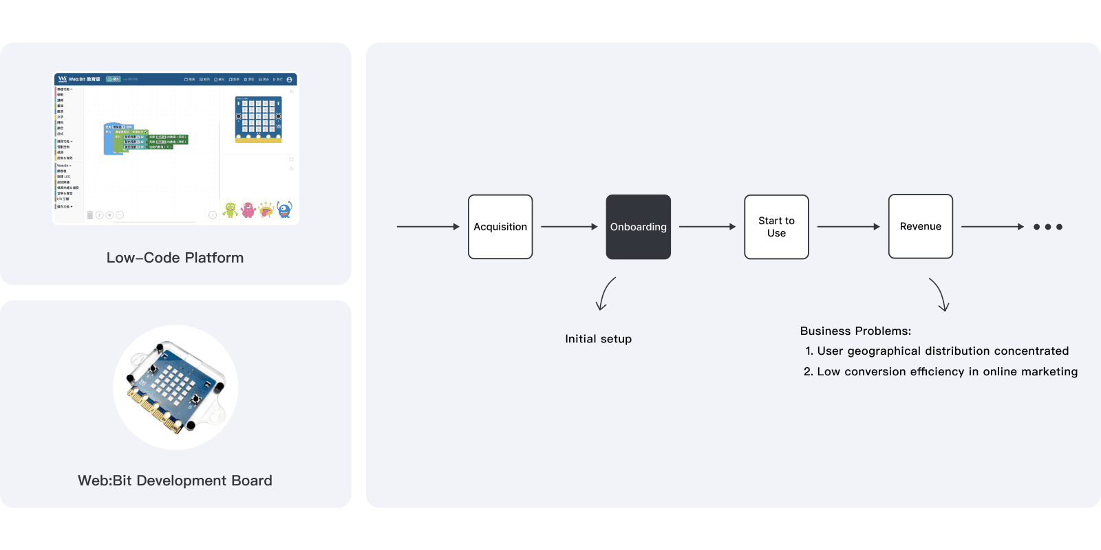
About Web:Bit
Web:Bit is a low-code education platform that helps elementary and middle school students learn programming through visual code blocks. Users can deploy code to a Web:Bit development board for IoT projects like light control and temperature sensing—making it easy for students to explore coding and IoT easily.

Background
Web:Bit consists of a low-code programming platform and the Web:Bit development board. Before first use, users must initialize the board through the platform by updating the firmware and connecting to Wi-Fi.
However, the team noticed a high failure rate during this setup process, which negatively impacted conversion rates from online marketing. In response, I proactively proposed and initiated a redesign to improve the onboarding experience.
Team
My role
Product Designer
Led 2 user interviews
Defined product strategy
Redesigned the user flow with 3 rounds of iteration
Conducted UI/UX design
Performed 2 usability tests and iterate
Members
Product Designer ( Me )
Developer x 3
PM x 1
Visual Designer x 1
BD x 4
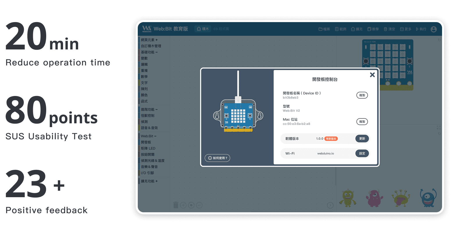
Key Outcomes
Problem
High failure rate and long completion time during initial setup. Even with the user manual, many users were unable to complete the process and eventually abandoned the product in favor of competitors.
Heavy reliance on sales reps, customer service, and resellers for onboarding. This led to geographically concentrated users and low conversion rates from online marketing efforts.
Students found the setup process tedious and unengaging, which caused them to lose interest in the product before even reaching the learning stage.

Challenges & Constraints
01 Product status & team alignment
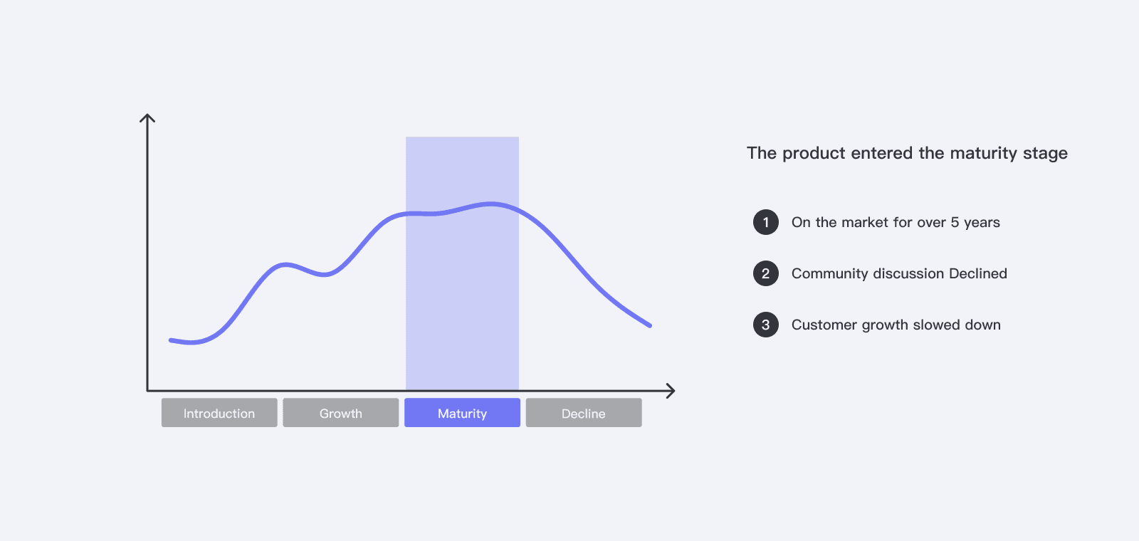
Web:Bit was in the maturity stage of its product lifecycle. As the product designer, I persuaded the team to allocate resources and development time—not only to fix product issues, but also to enhance brand value and drive business growth.
02 Design debt
Web:Bit had major design debt—style inconsistencies, mixed components, and a mismatch with the target audience. Updating the design system was necessary to save future development time.
03 Technical constraints
Web:Bit onboarding involves software-controlled hardware setup, limited by firmware logic. Designing the user flow required considering multiple approaches to work around these technical constraints.
Research
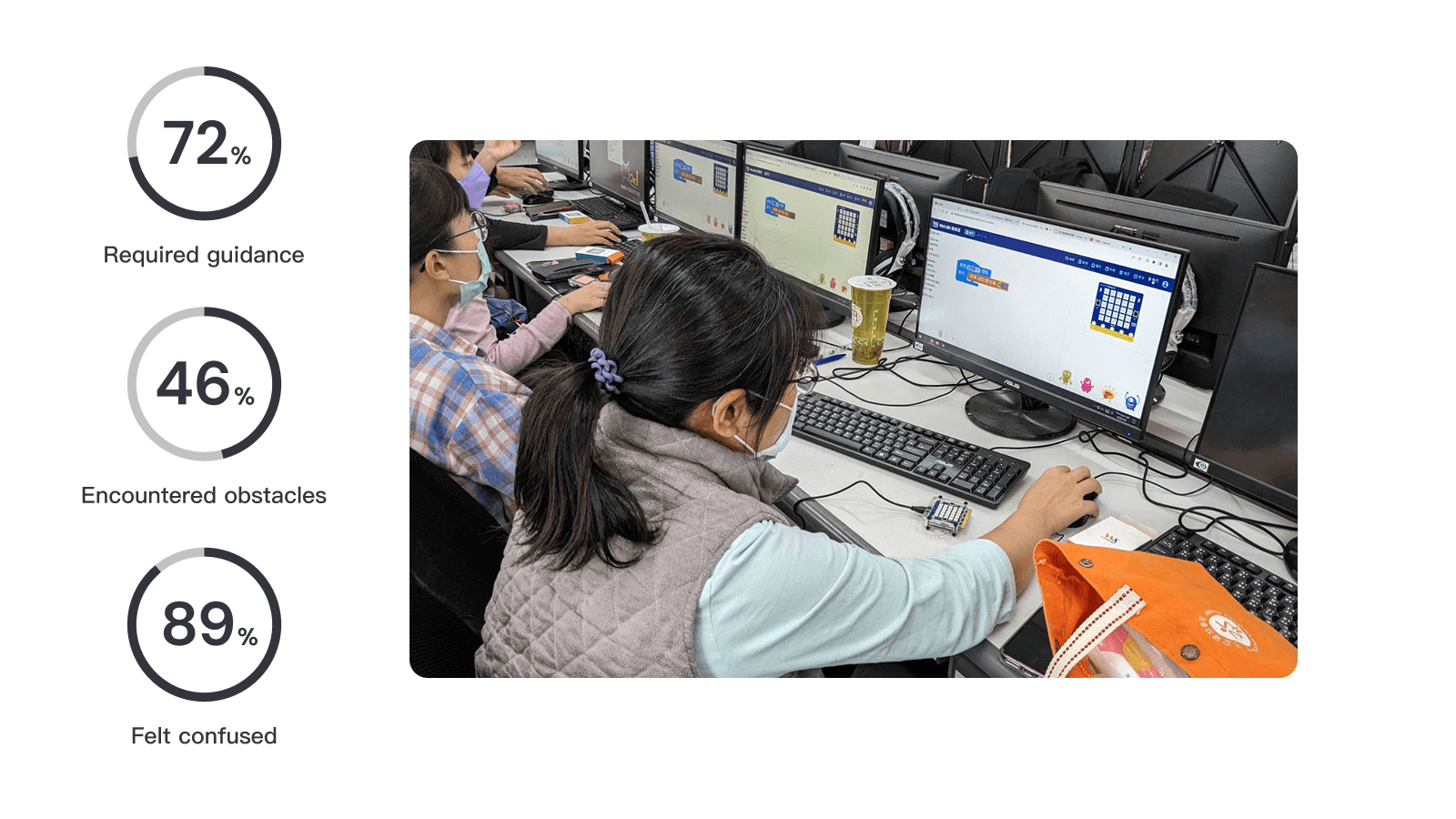
01 Field observation & interviews
I found the team lacked sufficient information about the problem, so I attended 2 teacher workshops for on-site observation and interviews.
Conducted guerrilla interviews and surveys
Collected and organized issues
Categorized problems by frequency and severity
Analyzed key pain points
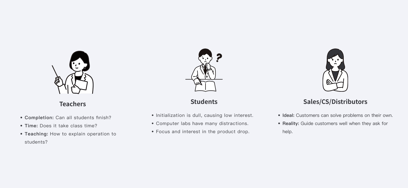
02 User Analysis
User - Teacher
Ensure students can smoothly complete the setup and quickly start their lessons.
Completion Rate: Are students prone to errors? Can the whole class finish the setup?
Time: Does the setup take too much class time?
Instruction: How can teachers effectively explain the setup process to students?
User - Student
The initialization process is too dull and boring, resulting in low learning motivation.
Most sessions take place in computer labs with many external distractions, which affect students’ focus on the product and further reduce their interest.
Team - Sales / Customer support / Resellers
Hope that customers can resolve issues on their own when problems arise.
When customers ask for help, they can be effectively guided.
03 Define Goals
Product Strategy: Brand Differentiation
Web:Bit is in its maturity stage. Beyond fixing user issues, we needed to create brand differentiation to stay competitive and maintain market share.
The goal was to design an engaging onboarding process that motivates students to learn.
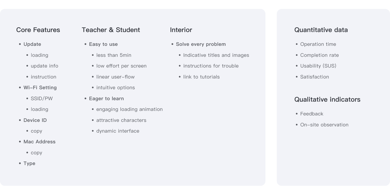
Feature Requirements & Success Metrics
Based on early research, current analysis, and product goals, I defined feature requirements and success metrics to guide subsequent design efforts.
Design Exploration
Based on the types, frequency, and readability of information functions in the product onboarding process, I planned the UI information architecture and communicated it with the team through initial wireframes.
Information Architecture Planning
Problem
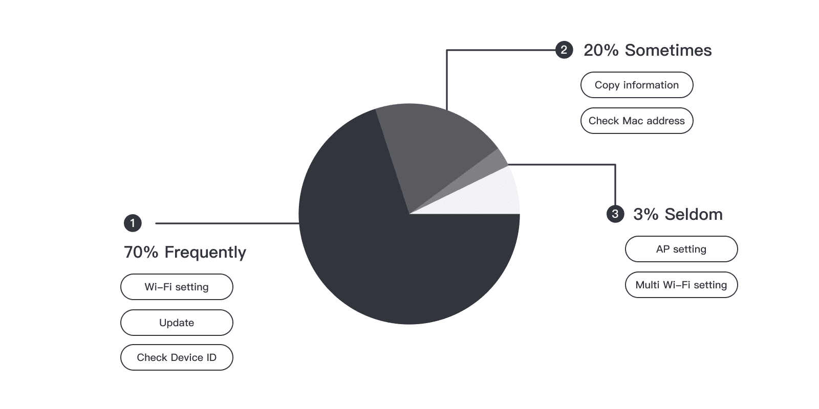
Users found it hard to tell if the Wi-Fi setting was for the computer or the development board.
Despite color-coded buttons, users still took too long to find the right option.
Design strategy
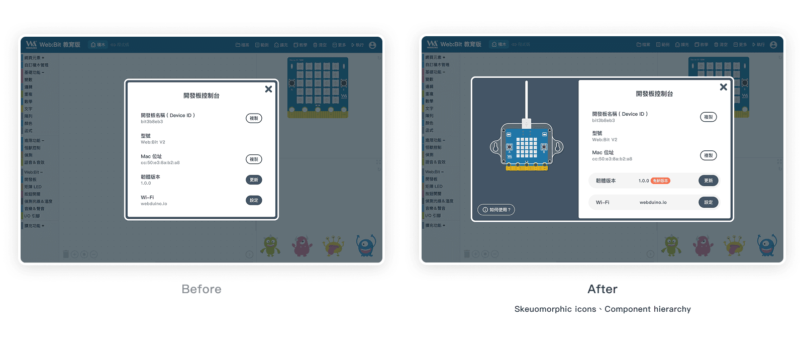
Skeuomorphic Icons: Guide users to differentiate between software and hardware.
Instructional Tooltips: Allow users to quickly view help when unsure how to proceed.
Component Hierarchy: Separate components into information and functions with distinct styles to guide user choices.
User-Flow
Problem
Due to firmware-level technical limitations, the software-controlled hardware initialization cannot achieve the ideal user flow.
After firmware updates, the development board automatically reboots, causing USB disconnection.
Different chip models on the boards prevent a uniform operating process.
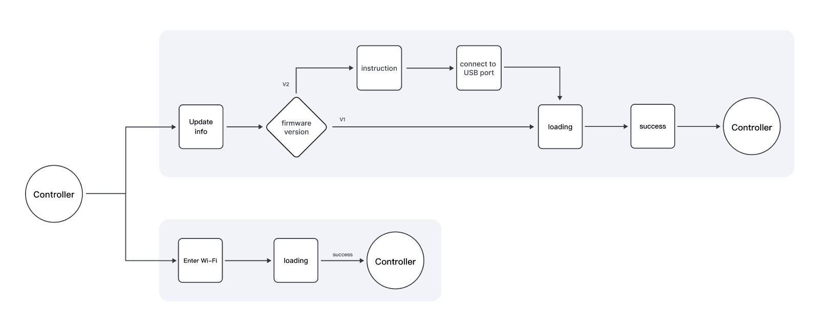
Design strategy
Segment users by context.
Analyze frequency, user paths, and perceptions.
Select the flow design with the best user experience.


Final Design & Iteration
Seamless Wi-Fi Setup Process
Considering young users, we used a step-by-step linear flow to reduce on-screen tasks and cognitive load, with transition animations to improve interaction.

A more engaging firmware update process
To ease the 3-minute update wait, we added a monster race animation with a cheering celebration to boost user engagement.

More intuitive to select USB serial port
Problem
When selecting a USB serial port, users struggle to decide if multiple USB devices are connected to the computer simultaneously.
Design strategy
System background processing to reduce steps → ❌
Filtering unnecessary options → ❌
Renaming options → ❌
Guided prompt window → 🟢
Due to Chrome’s native system limitations, methods 1, 2, and 3 were not feasible. After multiple discussions with engineers, we adopted method 4, successfully guiding users.

Design Principles & Design System
Defined key design keywords—lively, interactive, and engaging—and worked with visual designers and PMs to create mascot illustrations that ensure usability, consistency, and brand identity.
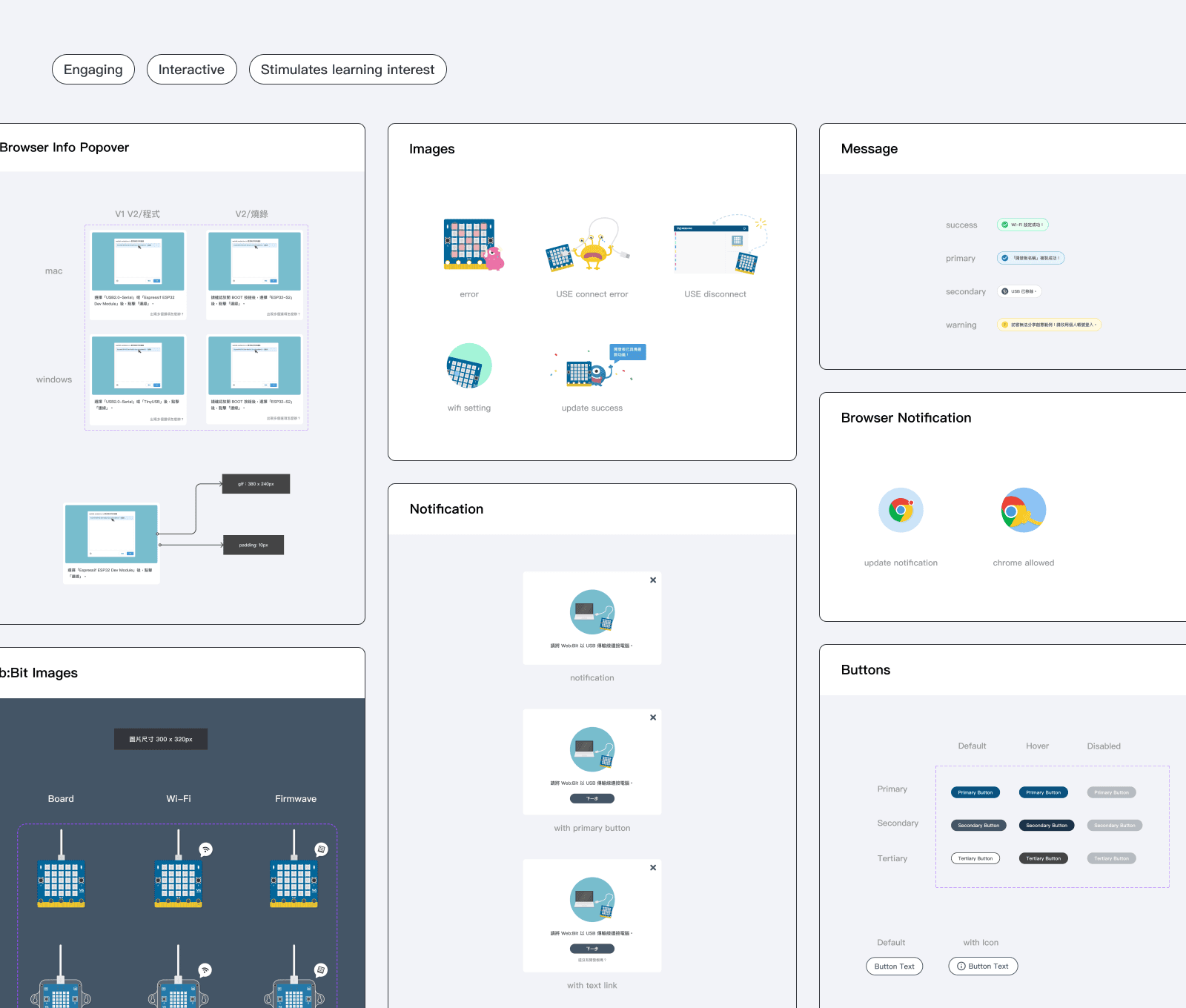
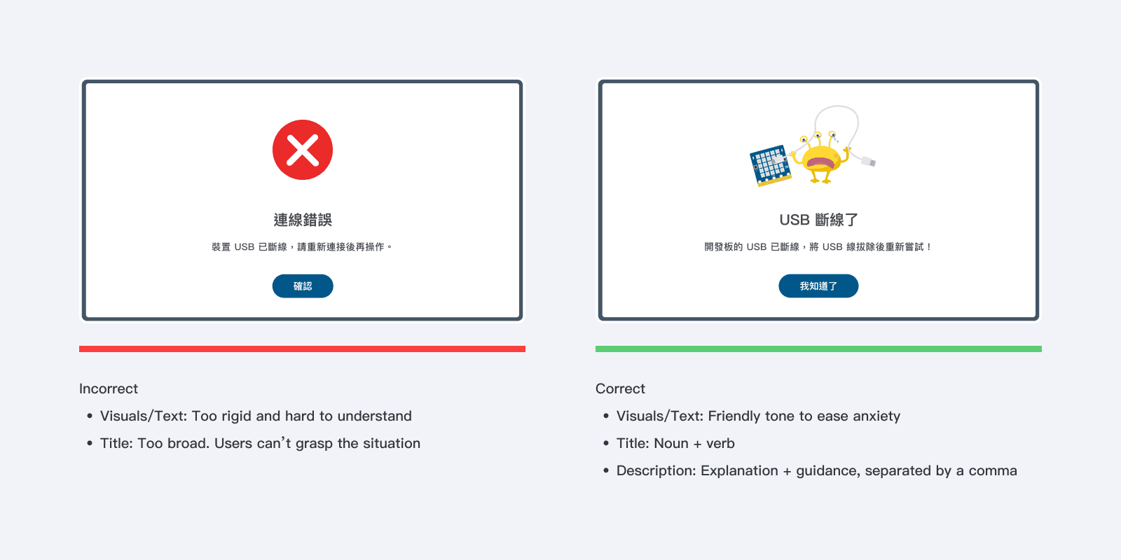
UX Writing Guideline
Edge Cases
After testing and official launch, user feedback revealed some edge cases causing errors.
Collaborated with engineers to identify 11 error triggers, then grouped them into 6 alert types based on context and logic.


Results & Impact
Regarding business value, due to the nature of the product, it is difficult to attribute all sales growth to these changes. Therefore, we focused more on qualitative metrics such as user feedback, teaching experiences, and purchase intent gathered from interviews.
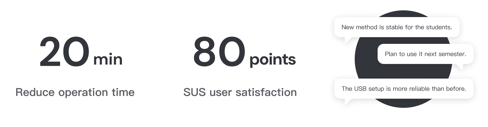
Not only did it resolve user issues, but it also reduced the cost of handling three customer service cases per month. I believe this is a key focus in product design—not only addressing user problems but also considering how to lower internal team costs to maximize overall benefits.

Insights & Reflections
The product still needs improvement in the “awareness to interest” and “initialization to retention” stages due to drop-offs in the user journey.
Though not my main project, I identified pain points and proposed solutions that delivered positive results and business value to the team.
What I brought to the team…
Translate business problems into design solutions to solve user issues.
Collaborated with team members to find the best user-centered design through iterative testing.
Make appropriate product decisions based on the current status and align the team toward a shared goal.
Behind the Scenes
During development, I found that engineers were not very familiar with using Figma and managing the design system. So, I created a presentation for the engineering team to improve collaboration and streamline workflows.
